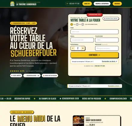
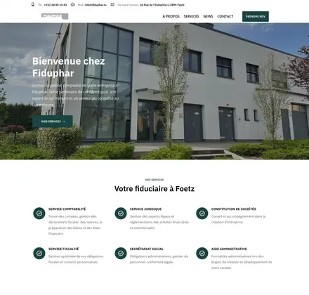
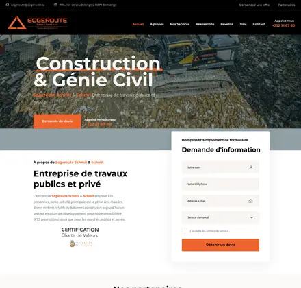


Typography is an often overlooked element when building a website. Yet it is of vital importance for user experience, accessibility, readability and even organic search. Well-thought-out typography improves the readability of content, highlights important information and creates a strong visual identity for your site. So take the following typographic rules into account.
What is typography?
Typography is the art of formatting characters. It includes not only the design of letters and signs, but also how they are arranged. It is not just about choosing fonts, but also about deciding on character size, line length and spacing, both within a single line and across a whole page.
The importance of typography
The quality of typography on a custom website is essential for:
- establishing an effective visual hierarchy,
- ensuring a harmonious graphic balance,
- setting the overall mood of the product.
It guides users and improves readability as well as accessibility for a positive user experience.
Good typography also makes it possible to:
- Strengthen brand recognition : typography helps express the personality of the website, which lets visitors unconsciously associate the typeface with the brand. A distinctive and consistent typography helps build a loyal user base, establish trust and strengthen brand awareness.
- Influence site visitors’ decisions: typography has a significant influence on how users perceive and absorb information. Typefaces that reinforce the message of the text are far more persuasive than those that do not support it.
- Capture the reader’s attention: careful typography can make the difference between a fleeting visitor and one who lingers on the site. Typography plays a central role in the visual appeal and memorability of the site.
The important rules of typography
1. Choosing the font
Choosing the typeface is one of the most important decisions in typography. There are a great many fonts, each with its own personality and appropriate use.
When choosing a font, consider the tone and context of your text. Sans serif fonts such as Arial, Helvetica, Roboto, etc. are generally used for body text. Serif fonts (in French), on the other hand, can be used sparingly for titles and headings to add a little style and variety.
2. Line width
This feature is often ignored, yet it is very important. Studies have shown readers’ preference for an optimal text width, generally around 70 characters per line, which is the standard width of an A4 page in a Word document.
3. Character size
It is recommended to choose a size large enough to guarantee optimal readability on all devices, including smartphones and tablets. A font size of between 16 and 18 pixels is generally recommended for body text, while titles can be larger to attract attention.
4. Spacing
The spacing between characters and lines has a significant impact on the readability of a text. Spacing that is too tight can make text hard to read, while excessive spacing can make it look disjointed and disorganised.
The ideal spacing depends on the context and style of your text, but as a general rule, it is recommended to leave enough space for the text to breathe without creating visible gaps.
5. Consistency
Typographic consistency is essential to guarantee the readability and credibility of a text. This means using the same fonts, sizes and styles consistently throughout the document. Avoid mixing too many different fonts, as this can make the text confusing and disorganised. By opting for a sober and consistent approach, you ensure that your text will be clear and professional.
6. Hierarchy
Typographic hierarchy means visually organising information by highlighting the most important elements. This can be done by using different sizes, weights or font styles to differentiate levels of content.
For example, headings can be larger and bold to attract attention, while the main text can be smaller and regular. With a clear hierarchy, you guide the reader through your text in a logical and intuitive way.
7. Alignment
Text alignment can have a significant impact on its readability and presentation. There are several alignment options, including left, right, centre and justified.
Each option has its advantages and disadvantages. In general, left alignment is the most commonly used because it offers smooth reading and makes visual navigation through the text easier. Justified alignment can also be used, but it needs particular care to avoid unsightly gaps between words.
8. Contrast
The dynamics of contrast let you emphasise the ideas or messages you want to highlight for the reader.
By exploring the potential of contrast, you can make your typographic text more captivating, more expressive and better at sparking interest. Designers often explore various options such as fonts, colours, styles and sizes to create a visual layout that energises the page and gives it greater impact.
9. Using bold and italics
Text styles such as bold and italics can be used to highlight important elements or to add visual variety to your text. However, avoid overusing them, as this can make the text hard to read and distract the reader. Use bold and italics judiciously to highlight key words or phrases, but take care not to compromise the overall readability of the text.
10. Text structure
Good text structure lies in coherent organisation and semantically precise expression. Make content more readable by using:
- HTML tags such as H1/H2/H3 headings
- Paragraph tags
- Bullet lists
This structured approach does more than make the text more accessible for readers. It also has a positive impact on its ranking in Google search results.
11. How many fonts to use
It is often recommended to use a single font for a website, a book or a document, as this ensures visual consistency. However, in certain specific circumstances, adding a second font can be justified. It is nonetheless essential to use discernment and to limit the use of fonts to two at most per document in order to maintain a harmonious and professional look.
CONCLUSION
In conclusion, typography is much more than a simple choice of typefaces. It is a fundamental element of web design that affects user experience, readability and even search ranking. By paying particular attention to these typographic rules, designers can create websites that are more attractive, more readable and more memorable. Investing in careful typography is an essential investment in the success and credibility of any online project.