Glossary / Brand and design
Typography
Also called: typeface, font
Typography covers the choice of typefaces and the way a text is set: sizes, weights, spacing.
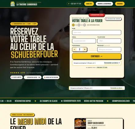
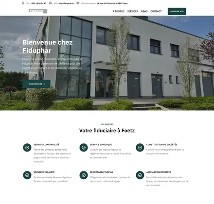
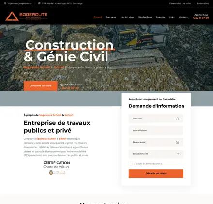
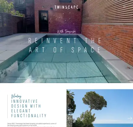
A typeface has character. Some evoke tradition, others technology or softness. The choice says something about the brand before a single word has been read.
It also affects legibility: a sufficient size, lines that are neither too long nor too tight, a clear contrast. One or two typefaces are enough for a visual identity. Their use is set out in the brand guidelines.
An example
This site uses a single typeface, Manrope, in four weights. Headings are in tight bold, body text in medium weight.
AR Digital’s advice
Check a font’s licence before adopting it. Some are free on paper and paid on a website.
To go further: Typography rules to know to improve your website
AR Digital / Brand and design
In the same family.
- Brand platformThe brand platform is the document that lays the foundations of a brand: its mission, values, promise and personality.
- Brand positioningBrand positioning is the place a company chooses to occupy in its customers’ minds, relative to its competitors.
- BrandingBranding is the work that builds a brand: what it promises, what it shows, what it says and the impression it leaves.
- MoodboardA moodboard is a board of images, colours, textures and typefaces that sets the mood of a project before it is created.
- TaglineA tagline is the short phrase that accompanies a brand name and sums up its promise.
- Tone of voiceTone of voice is the way a brand expresses itself in writing and speech: its words, its level of language, its attitude.